Libeřské lahůdky is a family producer of the traditional Czech delicatessen and they run a chain of delicatessen shops in Prague and surroundings. For this client we have been working for several years. We began with the production of materials for the promotion of the sale. In 2016 we helped with the change of branding and unification of the look of products for the promotion.
Logo before redesign on the left. On the right there is a new version of the logo. The task was to make the logo clearly arranged and cleanse the original one, to make it fresh and modern. Partly we were limited with the necessity to keep the continuity with the existing logo. Moreover there was needed to keep the shape due to the use of the existing oval shop signs.
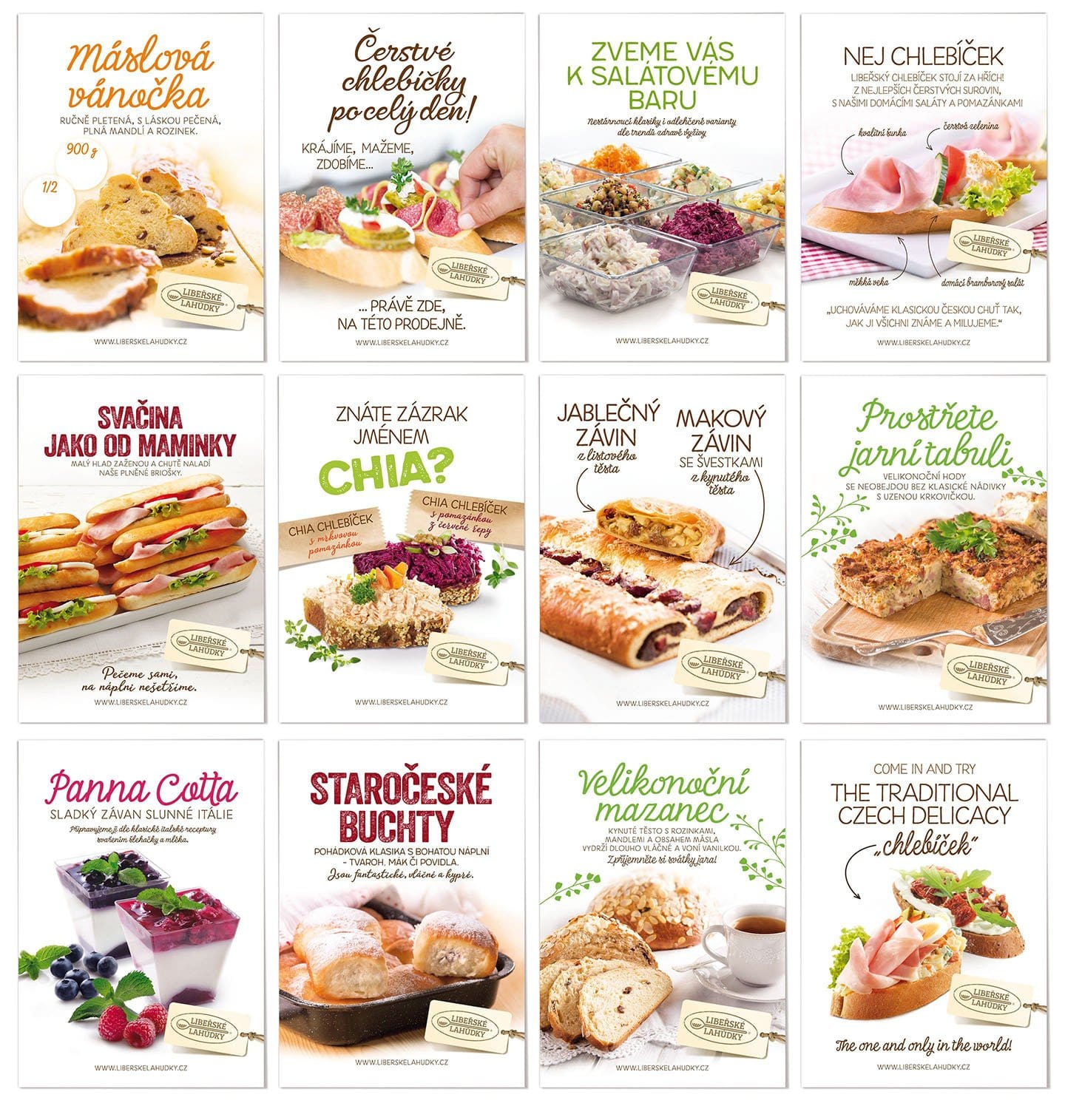
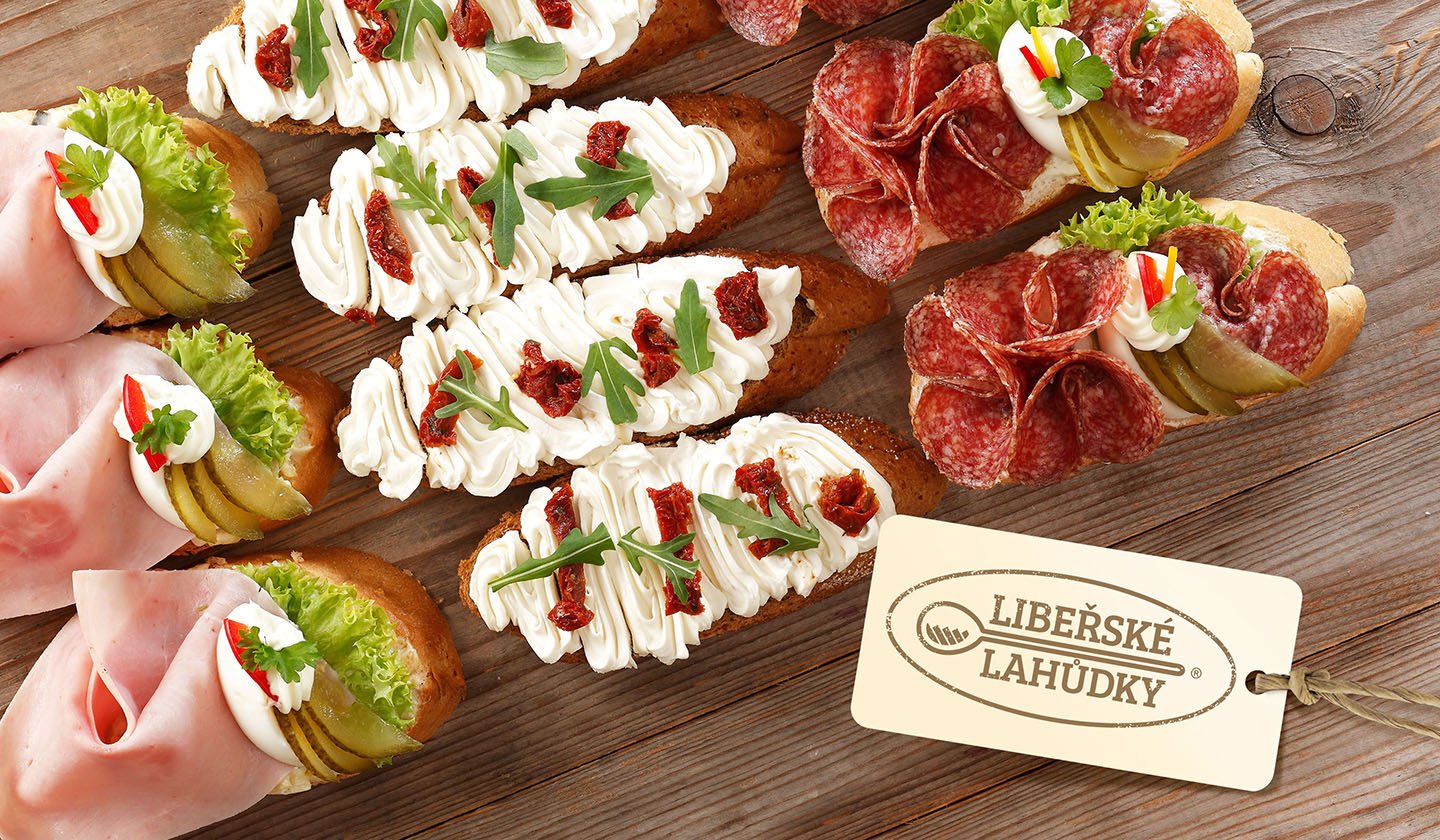
For the POS materials we created a special version of the logo on the tag. All in all we unified the concept for these materials which is used mainly for leaflets and posters into lighten frames. There were chosen fonts which evoked handmade production and product freshness. To the client we recommended the optimal style for product photos. Taking photo is realised by the client in-house.
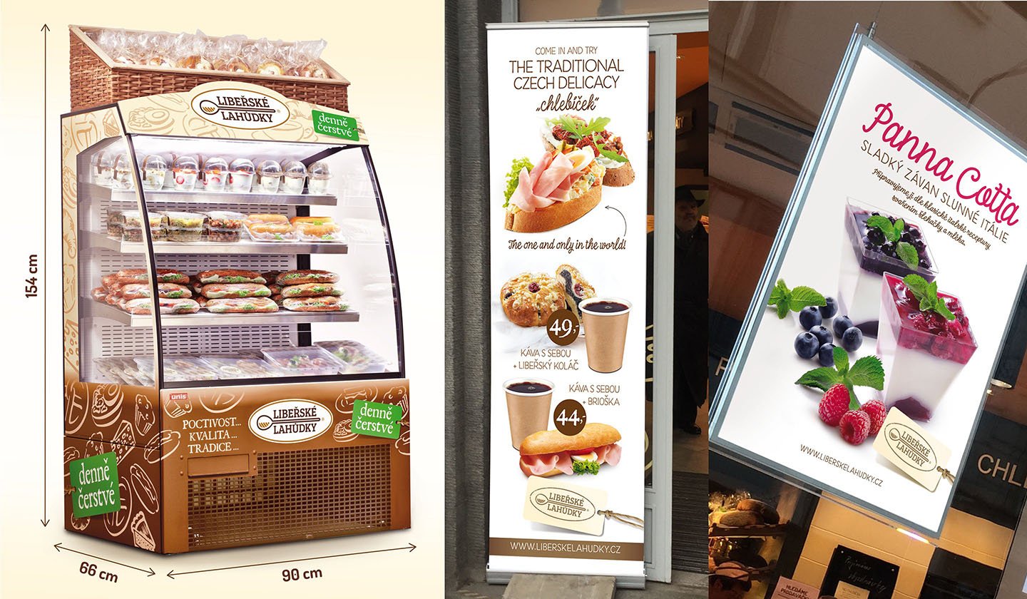
Besides POS materials we realise some proposals for a complete solution of the external look of shops, refrigerates for the sale beyond the brand shops, cars design of distribution fleet, roll-up banners, etc.
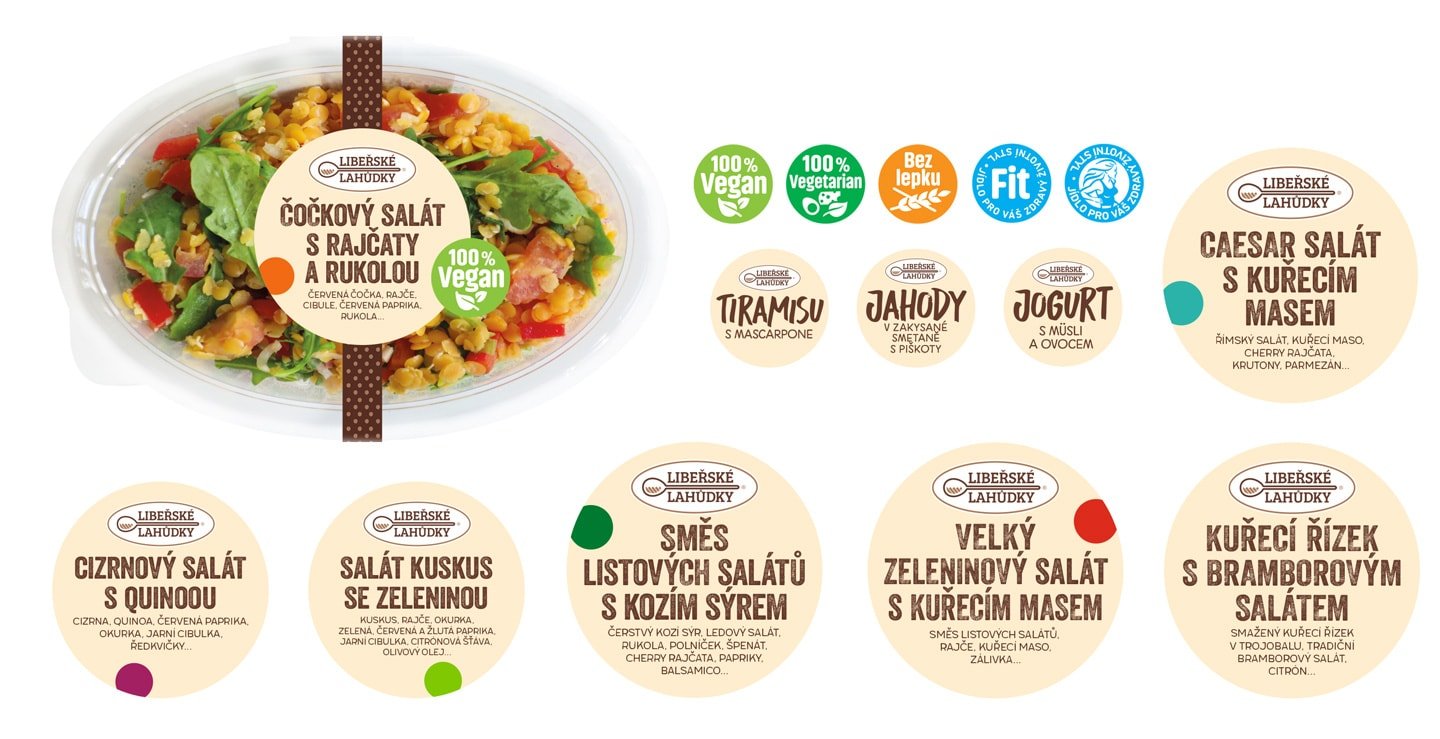
For sale refrigerates we have developed a system and label design for the products sold here. The system is variable and enables free combining. It consists of adhesive tapes and product round stickers. The tapes are not only the design element but they ensure the originality of the package as well. Smaller supplementary round stickers represent product benefits, for example, if it is suitable for vegans, vegetarians etc.
client: Libeřské lahůdky, Czech Republic  web: www.liberskelahudky.cz
  realised: 2015-2018
© Perflex, 2017