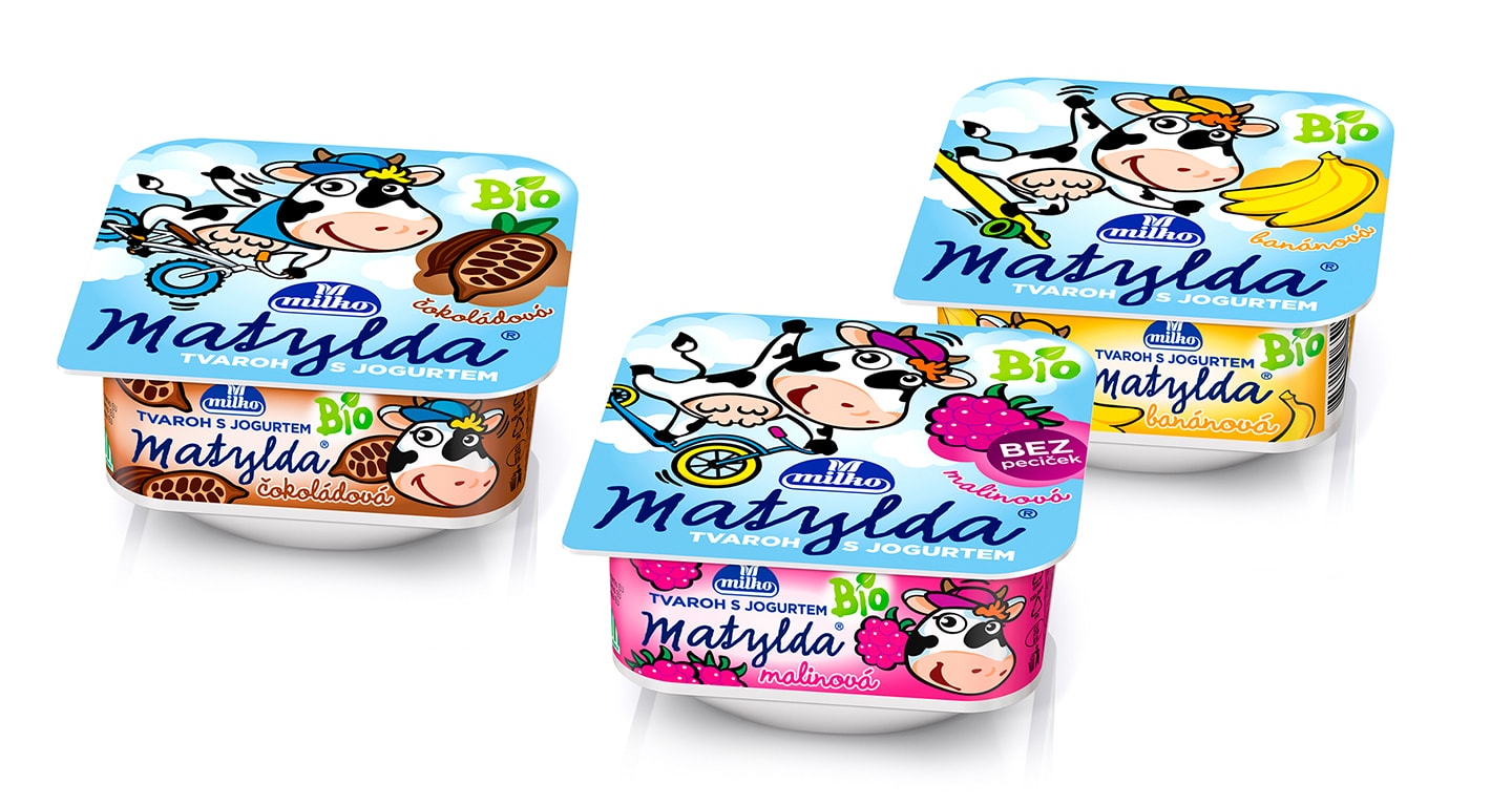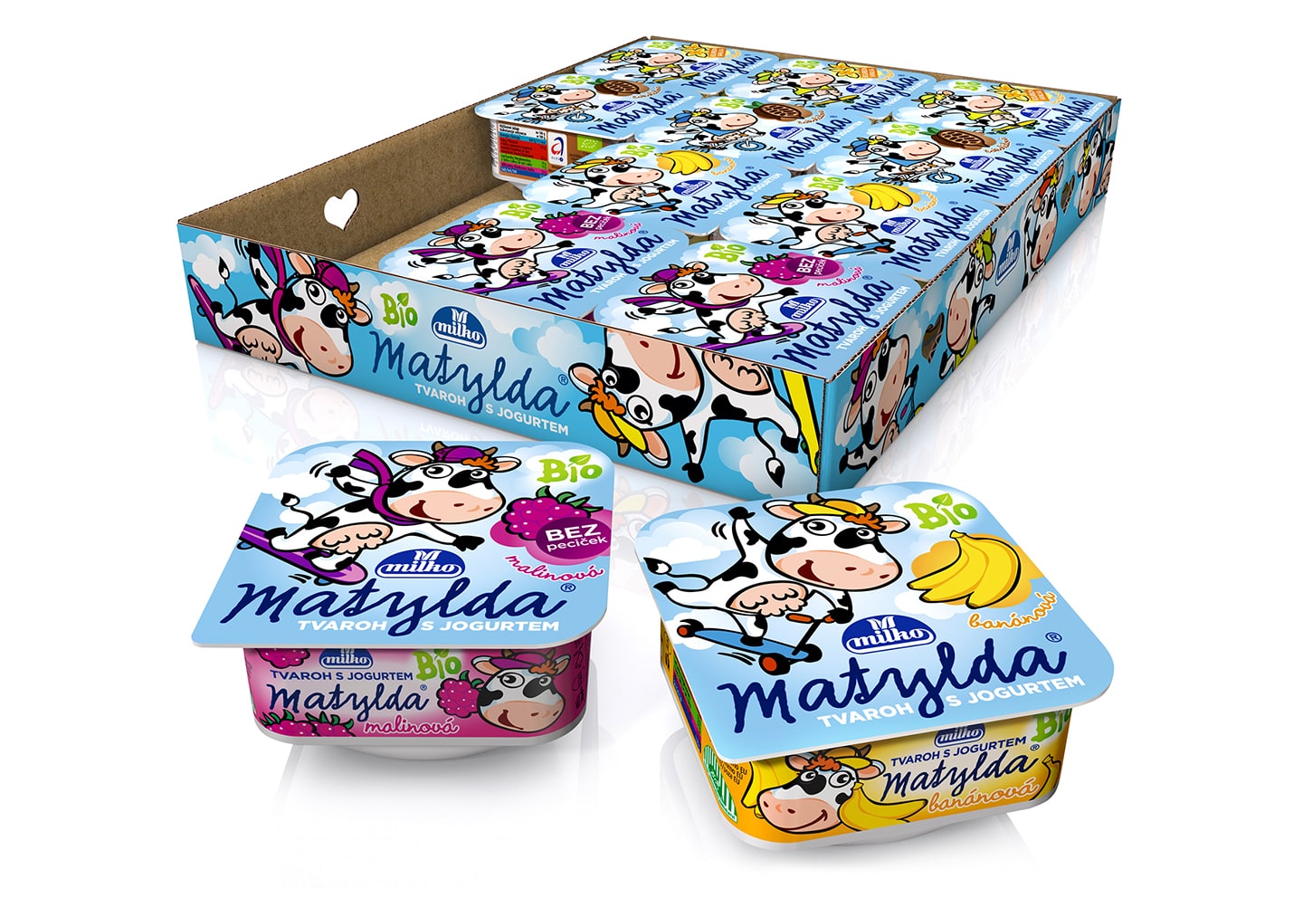

After nine years our original design with cow Matylda had become well-known and established at the market. Customers took a fancy to it and Matylda had become the guarantee of quality. After the agreement with the client we proposed simplification and cleansing of the design whose aim was to strengthen the position of the cow. The cow is now more noticeable and dynamic in contrast to bright blue background. On the lid there is flavour-coding, however, simplified and the main coding area is on the side of the cup.

Because in some shops the product is offered for sale in transport cartons, we solved printing of the carton as well.
client: Polabské mlékárny a.s., Czech Republic 

© Perflex, 2017