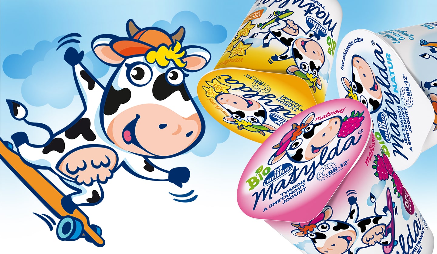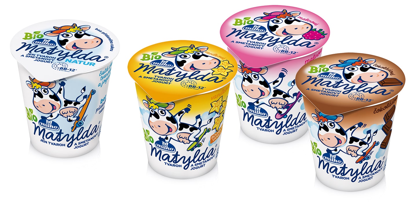

For every graphic designer it is exciting to create a new brand and to enjoy a long-term cooperation on its further advancement. For our team such a project is our work on the Matylda make. During our twelve-year work two major changes have been made – in the shape and the size of the cup. These have also influenced the design.
In spite of these changes in the communication area size we have managed to keep the clear-cut continuity with the older versions of packaging. Although the drawing of the little cow has been slightly altered, it is still Matylda, the star of all the packages of bio products Milko for children.

During the last change of the cup size we polished the design and emphasized the colour coding of flavours. The cancelled banana flavour has been replaced by a clear variant made just of Cottage cheese and cream yogurt.

Part of the change was a slight adjustment of the Matylda logo. The logo has been made more elegant, more legible and visually rejuvenated.
client: Polabské mlékárny a.s., Czech Republic 

© Perflex, 2021