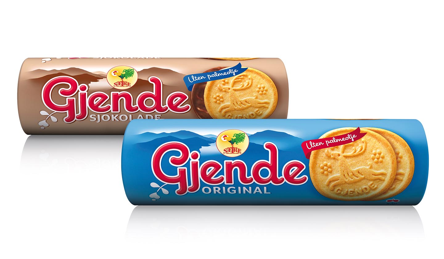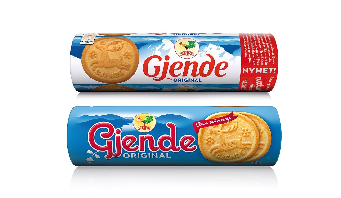

Sætre is a Norwegian producer of biscuits. For company Orkla Confectionery & Snack Norge we have been working for many years. That is why we were really pleased when our client asked us for cooperation on the redesign of traditional biscuits Gjende. These traditional biscuits have been produced since 1954 and for many Norwegian people they are joined with memories from their childhood. Name Gjende comes from the name of one glacial lake in the Jotunheimen mountains.
Original design

New design
Our aim was to create a clear design which would refer to the area of its name. Into the background we put a simple drawing of lake Gjende surrounded with the mountains. We proceeded from the view which is well-known and for the Norwegians clearly identified. We chose a conspicuous colour coding variant. The background was made not to arise some noticeable change between individual blocks. The result was a design which is visible and looks compact without any disturbing elements. The product is clearly identified and distinguishable from competitive products.
client: Orkla Confectionery & Snacks Norge, Norway 

© Perflex, 2017