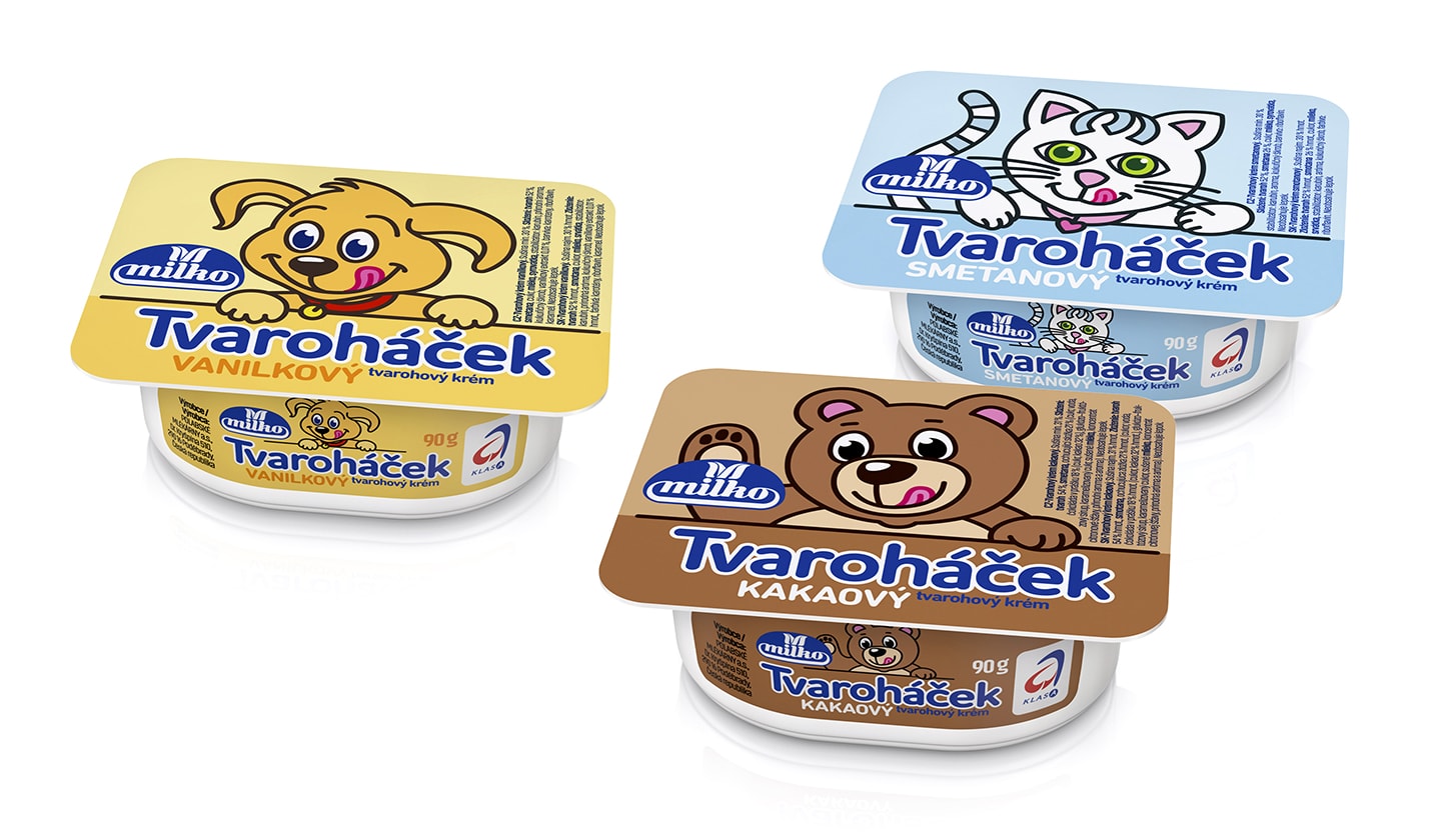

Tvaroháček is one of the important products of Polabských mlékáren. It is quality cottage creme for little children. Too colour-marked original design didn´t correspond with the character and ingredients of the product.

We have harmonized and cleaned the drawings of animals in style. The design has been proposed, on purpose, simple in pastel colours which sufficiently evokes the natural structure and milk base of the product.
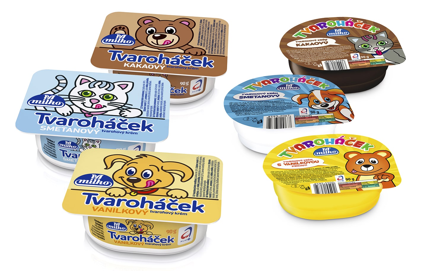
New design
Original design
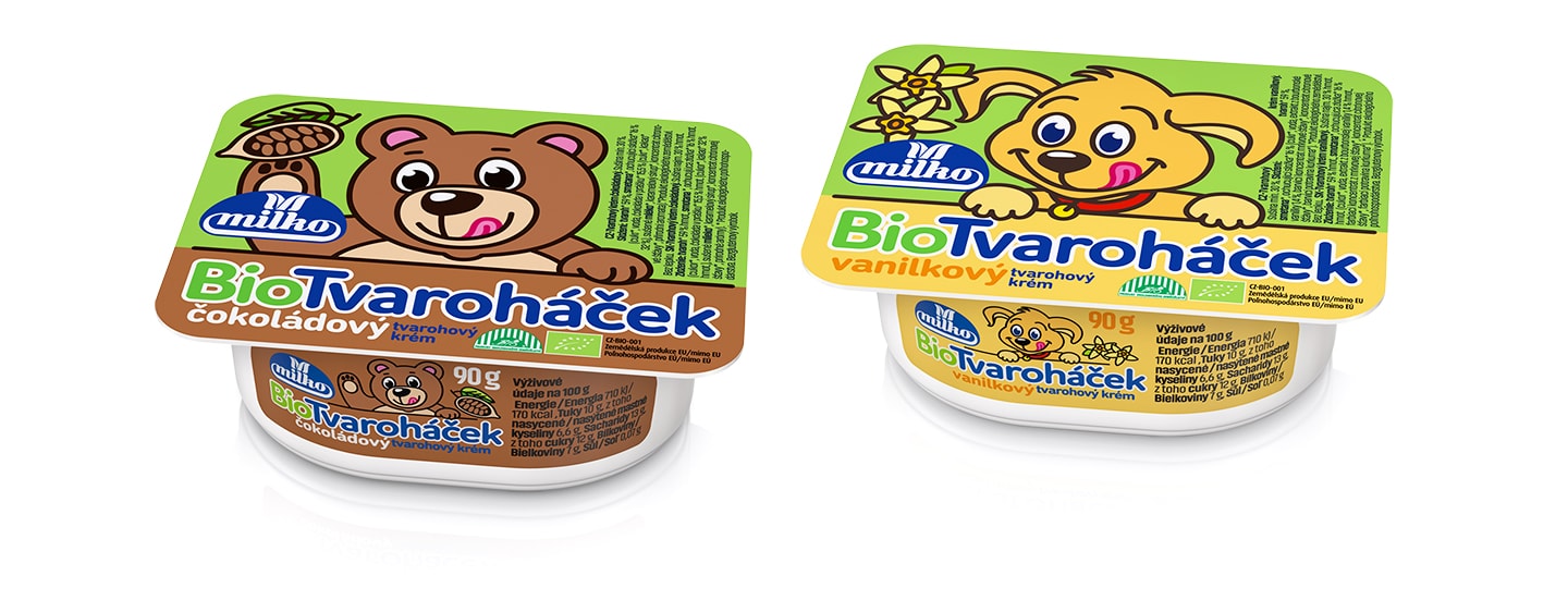
Because of the requirement made by supermarket chain Lidl the brand Tvaroháček has been enlarged with the organic versions. The graphic design is based on the original Tvaroháček design and is just highlighted with the markedly specific coding in fresh green colour and altered according to client's requirements.
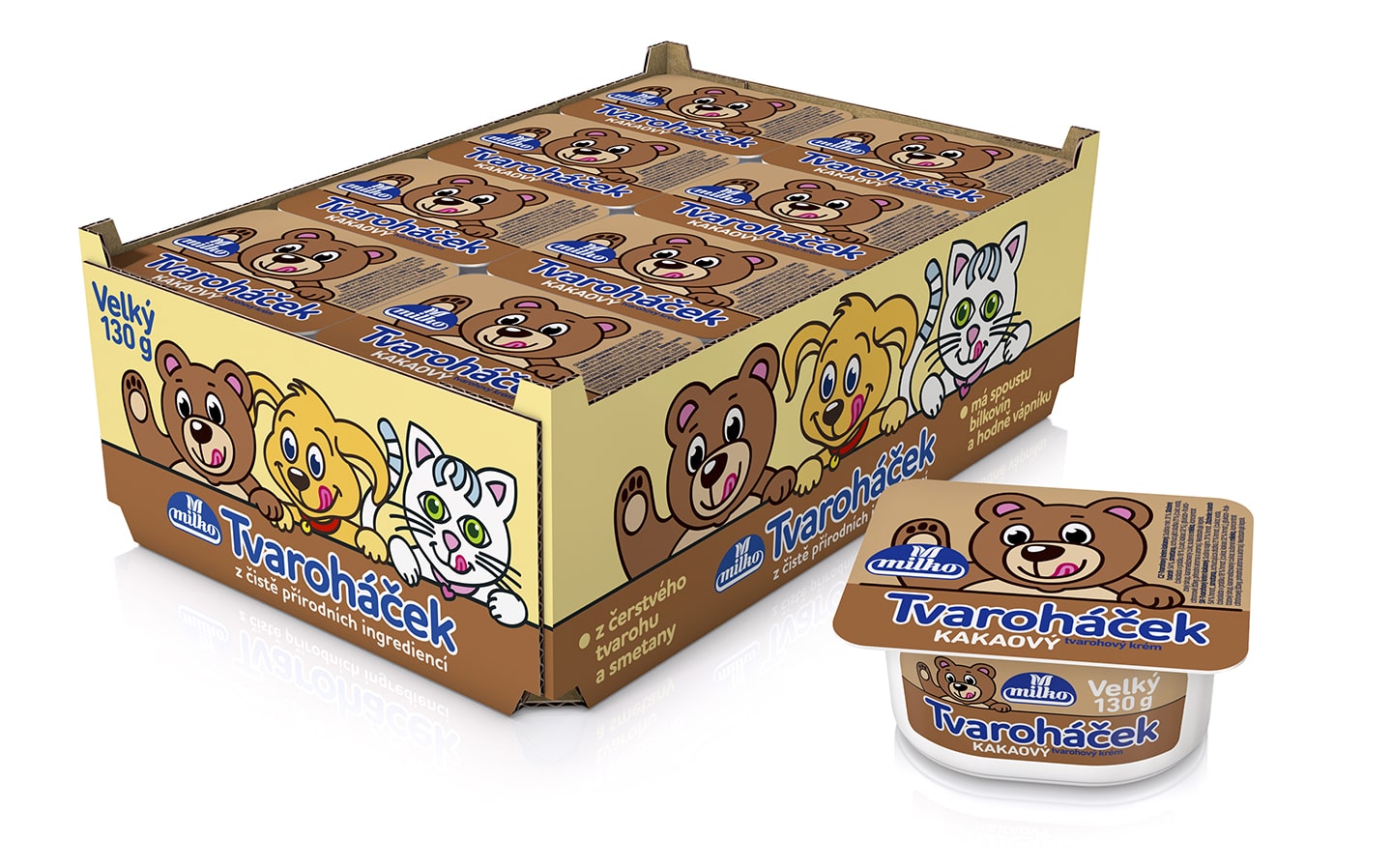
Because in some shops the product is offered for sale in transport cartons, we solved printing of the carton as well.
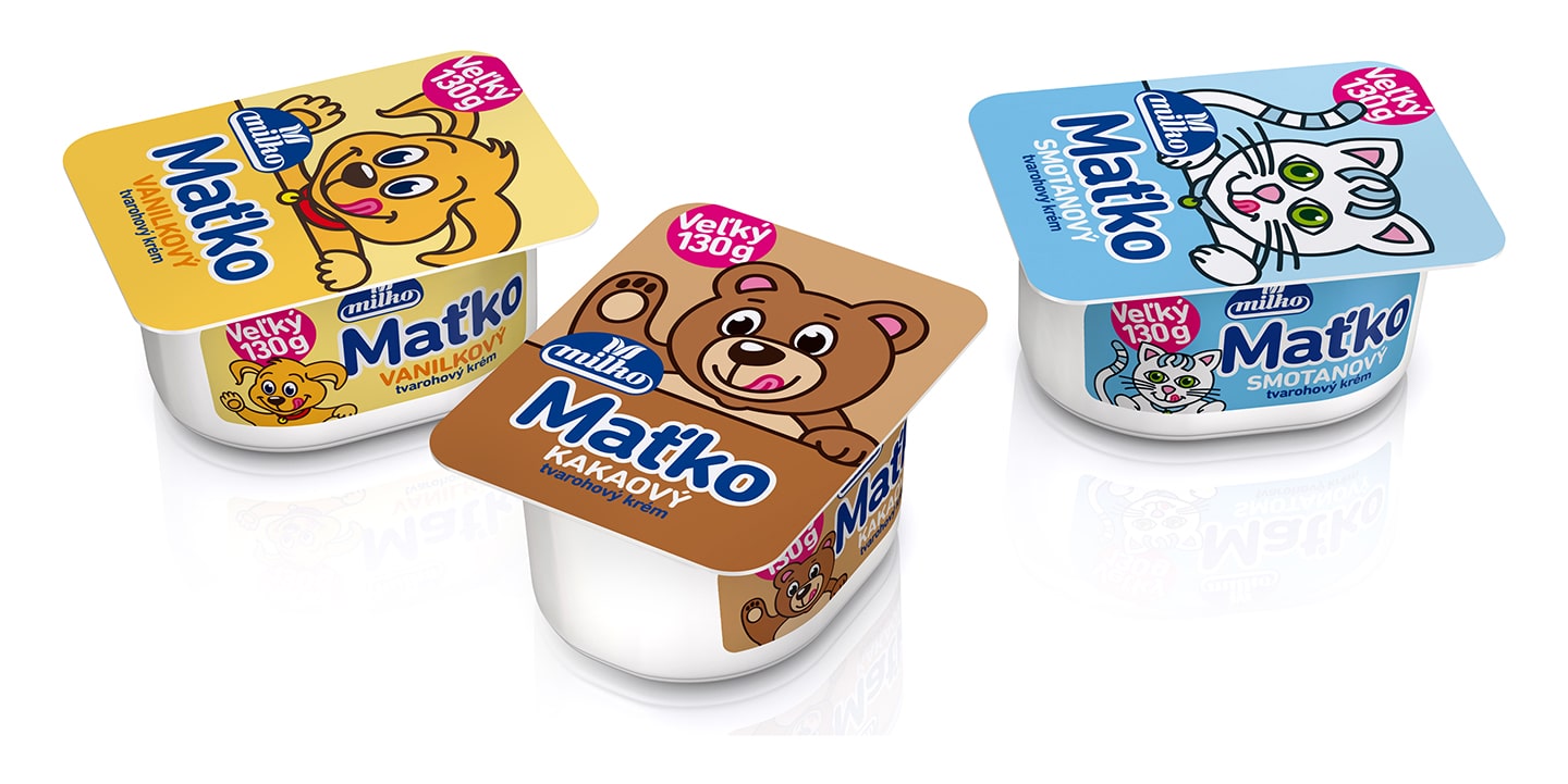
The design of Tvarohacek for the Slovak market has been adjusted as well because its name has been changed to Matko and the compulsory text needed to be moved to the back label. These changes have allowed us to turn the lid design by 90 degrees. Thus the design has become more modern and clearer.
client: Polabské mlékárny a.s., Czech Republic 

© Perflex, 2022