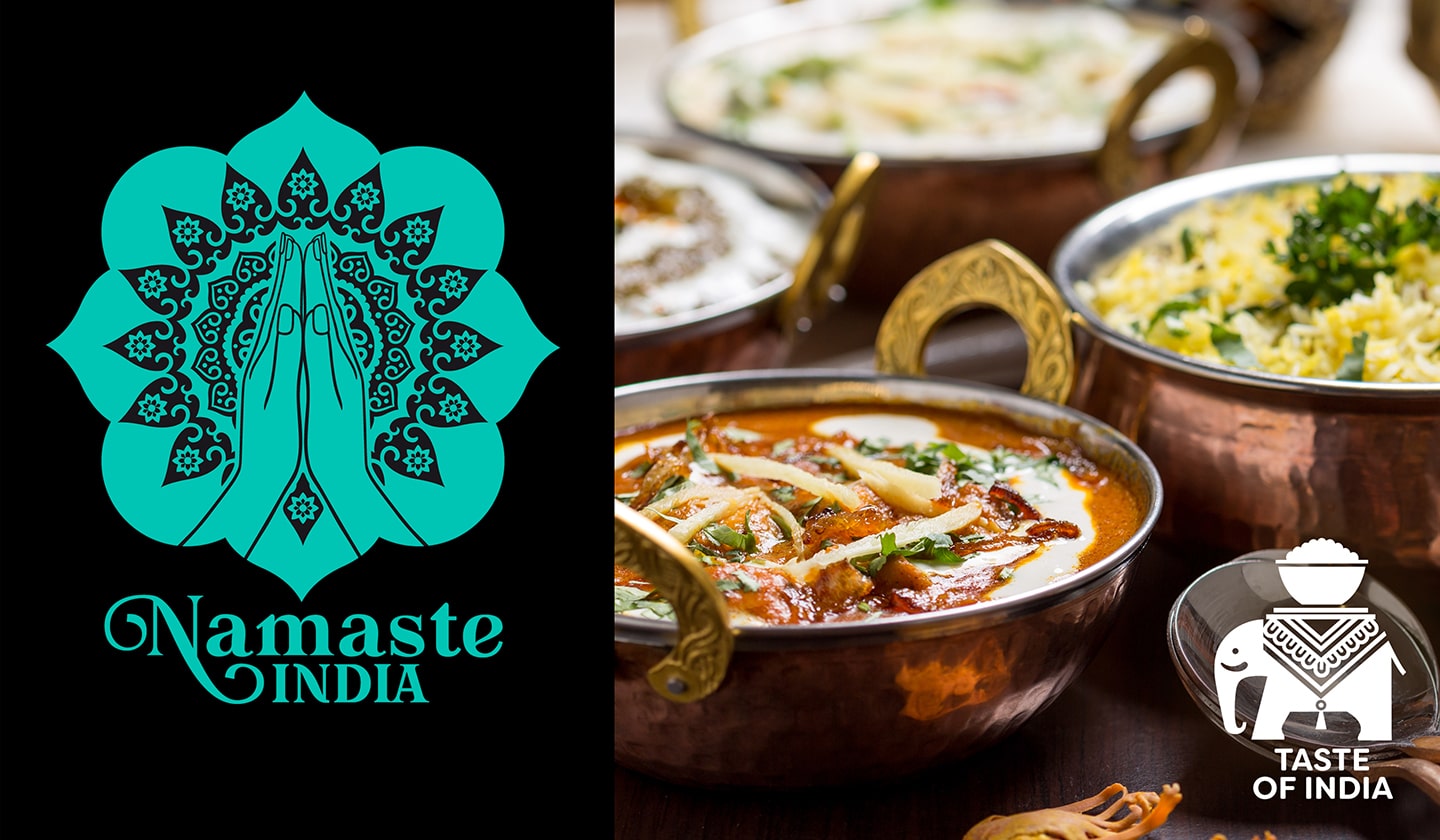
At the end of 2023, we were approached by our client Indian Gourmet Norway to create a new brand and packaging design for authentic Indian sauces. The client had a pretty precise idea about the name and the basic theme of the graphics. Our task was to incorporate the name "Namaste" and the hand symbol in the greeting.
By gradually simplifying the motif of the mandala and the drawing of the hands, we arrived at a simple vector graphic of the symbol. We complemented this symbol with a serif font with a distinctive dynamic stroke contrast and decorative details at the letter N, which better evoke the quality and sophistication of the flavours of a wide range of Indian sauces.
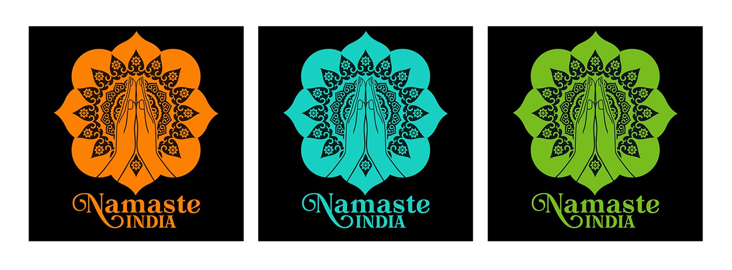
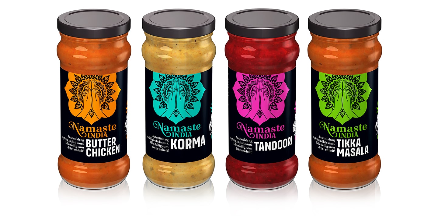
The client decided to launch to market sauces in glass containers with a label. Simple brand graphics allowed us to create distinctive but simple vector labels with strong colour coding and an easy to read sauce type name. On the sides, the text information is complemented by playful small details such as the spiciness symbol, the flower ornament and the elephant symbol, which will be used for other product lines.
The client received a distinctive and recognizable design on the shelf. Another advantage for the client is the technologically and cost-effective production of the label, as each label is printed with only two Pantone colours.
client: Indian Gourmet AS, Norway  web: www.namastefoods.no
  realised: 2024
© Perflex, 2024